Hi there!  I’m Monia, a Toronto based Senior User Experience Designer passionate about creating experiences that are delightful and easy to use.

Résumé

Experience

July 2020 - Present
Fiix by Rockwell Automation
Lead User Experience Designer

January 2018 - July 2020
Rangle.io
Senior User Experience Designer

June 2010 - January 2018
Questrade Financial Group
Senior User Experience and User Interface Designer

May 2015 - December 2017
WCKD Marketing
Freelance Designer

Education

2019
AlterSpark
Emotional Design Psychology

2015
AlterSpark
Psychological Architectures of Digital Behavior Change

2014
Scrum Alliance
Certified ScrumMaster®

2005 - 2008
Durham College
Multimedia Design Advanced Diploma

2004 - 2005
Durham College
Foundations in Art and Design Certificate

Volunteer work

March 2018 - March 2020
Bridge School
Lead Mentor, Operations

Skills & tools

User research, Usability testing, Lo-fi/hi-fi wireframes, High-fidelity mockups

Figma, Sketch, Invision, Abstract, Miro

About

I’m Monia, a Senior User Experience Designer at Rangle. My journey as a designer began 10 years ago as a graphic designer but became passionate about creating human-focused digital experiences.

In between 2018 and 2020 I was a volunteer for the Bridge School community as a Lead Mentor, Operations. Supported the Bridge for Product Design team to continuously improve the program and volunteer experience.

Some of my intererts are: painting, travelling, outer space.

Feel free to connect with me on LinkedIn

Me at Guillermo del Toro’s ‘At home with monsters’ exhibit at the Art Gallery of Ontario.

Me at Guillermo del Toro’s ‘At home with monsters’ exhibit at the Art Gallery of Ontario.

Fiix by Rockwell Automation


Work Orders workflow improvements

Role
UX Designer/Researcher

The background

In 2019, the Fiix product team kicked off the efforts to upgrade the CMMS software (V6) to micro-services architecture which would enable scrum teams to develop and deploy changes to the application independently of each other. As part of this initiative, UX and UI also needed to be upgraded because the application was developed and designed in 2008, and the experience and interface were outdated as the needs of the customers evolved.


The problem

I joined the Fiix UX team in mid-2020 as a Sr. UX designer and I was part of the ‘Work orders service’ scrum teams (Nova and Sirius). As the UX designer for this team, I was tasked to resolve an unintentional limitation that was introduced in V6 work orders service1. When creating a work order, the user was focused on inputting asset information; once that information was added, they could not remove or replace it, especially for customers in the Free and Basic tiers.

In the past, an assumption was made that work orders cannot be created without asset information. However, after consulting with subject matter experts (SMEs), customer service, and customers we learned that there are few use cases where work orders can be created without assets.

1 Work Orders service is used to track maintenance work for highly valuable equipment. These work orders are assigned to technicians who are responsible for repairing equipment that may have unexpectedly been damaged or preventing the equipment from an unexpected shutdown.


The challenge

  • Stakeholder alignment to understand the needs of the customers and agreement on how we should proceed
  • Get feedback from customers and how they are using the feature
  • Rework the existing logic and user workflows within a short timeline
  • Past discoveries on this topic were not documented anywhere so we were unsure of how the limitation came to be

The process

The first step in resolving the unintentional limitation was to learn from our SMEs about the various use cases our customers create work orders based on the maturity of the organization's maintenance practice. We discovered various use cases in which users create asset-less work orders, such as:

  • Creating a draft work order for planning purposes
  • The asset has not been added to the CMMS yet
  • Working on an asset that is not tracked in the CMMS
Customer survey

With the information we learned from SMEs, I then created a survey to collect customer feedback to cross-validate what we had learned.

Survey set-up:

  • Created a survey using the Optimal Workshop tool
  • Optimal Workshop limitation: needed to create the survey x3 to ensure we gathered as much data as possible
  • The study consisted of five questions
  • The study was posted in the Fiix community to gather feedback
  • We were able to collect data from 23 participants

Summary of findings:

After synthesizing the survey results, we conclude that there are valid use cases where users will leave the asset field blank. To support these use cases, we need to remove the current asset field requirement.

Total number of participants 23

  • 17/23 participants noted that they created WOs without assets
    Of the 17 participants...
    • 2 noted they are in the Basic tier
    • 8 noted they are in the Enterprise tier
    • 4 noted they are in the Professional tier
    • 3 noted they are NOT sure which tier they are in
  • 6/23 participants noted that they have never needed to create a work order without selecting an asset
Customer survey set-up Customer survey results
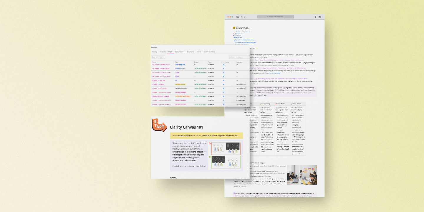
Clarity Canvas:

Based on the findings from the survey and SME conversation, I decided to facilitate a Clarity Canvas activity with the stakeholders. The purpose of this activity was to:

  • Align on user and stakeholder goals
  • Gain clarity on users and use cases we want to support within the Work Orders service
  • Uncover advantages, opportunities, and concerns with different approaches

Participants:

  • SMEs
  • PM
  • Engineers
  • Designers

Summary of findings:

  • [Data quality impact] Without good quality data, customers have a hard time requesting additional budget because data is missing to justify the  time/cost spent
  • [Data quality impact] Customers often do review meetings on work orders to look for missing data (eg. missing priority, missing asset). Could be on a weekly/monthly basis
  • [Feature] Asset field configuration only available in enterprise tier (should this be available to all tiers to help educate them on maintenance best practices, especially for customers who are coming from pen and paper
  • [Mismatch] Mismatch between the language used on the floor vs in the CMMS system (how can we bridge the gap?)
  • [Mismatch] Mobile vs desktop search don’t match - trying to find the right asset in mobile can be frustrating
  • [Data quality impact] Regardless of organization, finance  plays some role and has a downstream effect  when there is no proper tracking (e.g. finance  department)
  • [Data quality impact] Date inaccuracy can lead to questioning of a manager's knowledge and  competency
  • [Data quality impact] Anyone should be able to  read the work order and know what happened
Clarity canvas
Ideation session

Based on the Creative Canvas findings we concluded that we want to be able to provide a flexible system, but in a way that it doesn't become an impediment for Fiix as well as the customers because we want to enable them to support themselves especially when additional resources are needed, etc.

Participants:

  • PM
  • Engineers
  • Designers

Considerations:

The findings were converted into actionable considerations which were taken forward into the ideation session with the scrum team

  • [Flexibility] How can we avoid pitfalls when customers make fields mandatory (how can we support members who might not know what needs to be added on the work order form)
  • [Data quality impact] Sometimes being forced to enter something into a field is worse than entering nothing when it comes to data quality
  • [Onboarding/Education] Educating users on best practices without forcing them down one specific workflow
  • [Onboarding/Education] Notify to add assets later, letting them know the cons of asset-less WOs
  • [Onboarding/Education] Make the onboarding process easier for customers to navigate themselves
  • [Feature] Customers are frustrated that in V5 - some basic features like making a field mandatory (eg. asset field) are locked behind the enterprise tier. More customers would like the  ability to do this
  • [Flexibility] Limited capabilities will alienate some users
  • [Information hierarchy] Planners/managers: can  quickly identify work done by team members
Ideation

The solution

How might we balance the needs of maintenance teams who use asset-less work orders with Fiix's needs to educate the users on good maintenance practices, preserve data quality, and use CMMS data for enhancements?

To manage user expectations, we need to design a solution that will give users the flexibility they need to accomplish their tasks without blocking them, but also educate them on the maintenance best practices.
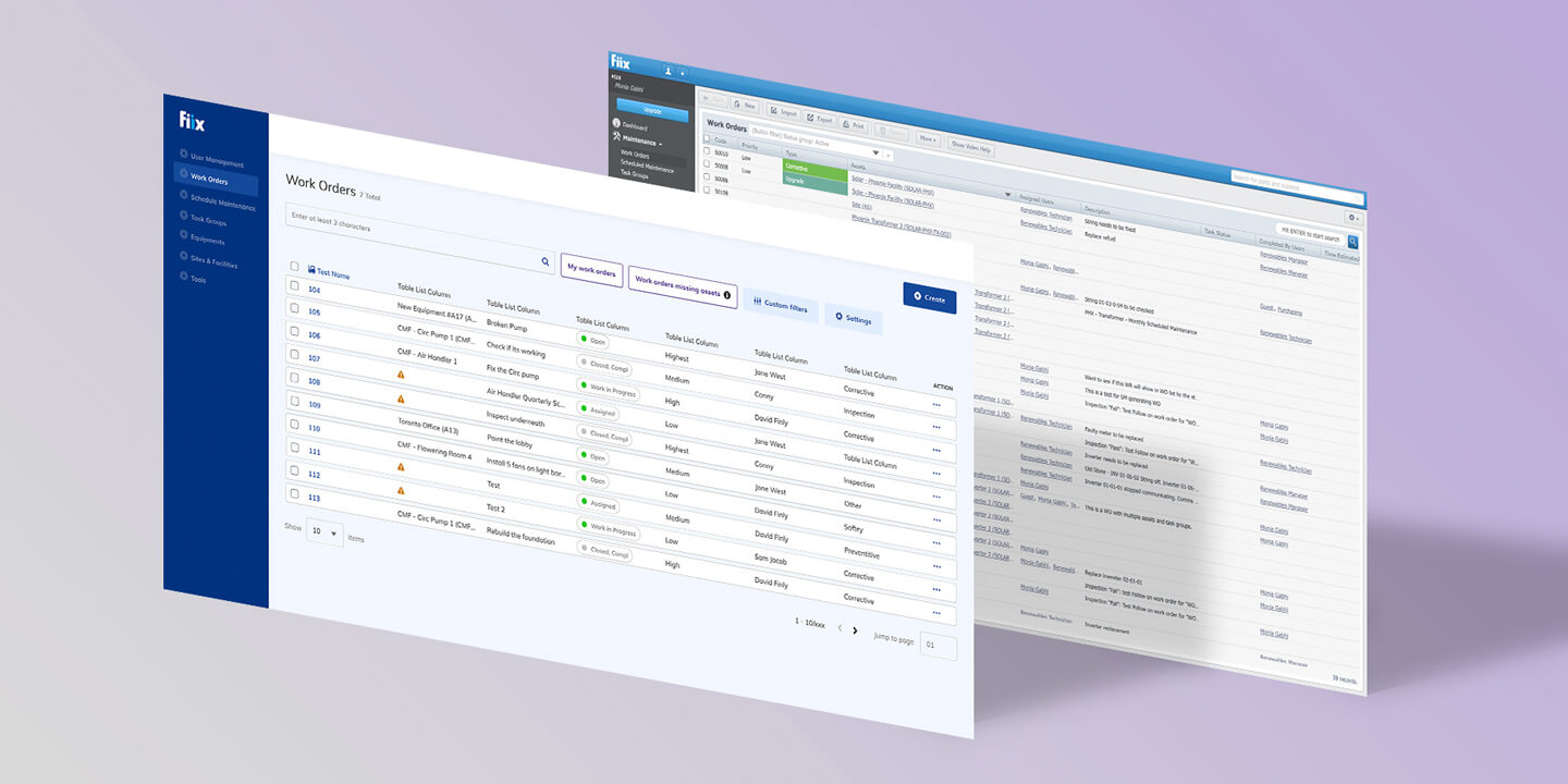
  • Remove the asset information requirement in V6 Work Orders
  • Educate the users on best practices without forcing them down one specific workflow
  • Indicate when asset information is missing to enable admins/managers to input the information that a technician might not be able to input
  • Simplify and streamline the overall workflow
Wireframes Visual Design

Fiix by Rockwell Automation


Building foundational knowledge

Role
UX Researcher

This content is password protected

Please contact me on LinkedIn for access.

Dick’s Sporting Goods


E-commerce experience & Design system

Role
UX Designer/Researcher
Duration
~5 months (2019)

This content is password protected

Please contact me on LinkedIn for access.

Questrade Inc.


Open an account application redesign

Role
UX/UI Designer
Duration
~3 months (2017)

The problem

Questrade wanted to redesign its online account application due to a significant drop-off rate at the beginning of the process, which led to several incomplete applications. Users were presented with multiple account options but could only open one account at a time, which caused users a lot of frustration. The application process consisted of three steps: Set up your account, Sign & submit additional documents, and Fund your account, each step was strenuous and long. On top of that, the application was visually outdated, unresponsive, and unintuitive.


The challenge

  • Condensing the list of account types shown on the account selection screen
  • Guiding the user through the application process by visually communicating and tracking their progress
  • Simplifying the language and informing the user what information was needed and why, to reduce ambiguity
  • Collaborating with stakeholders to balance the needs of the business with the needs of the users
  • Collaborating with developers to ensure the approach was feasible

The process

Stakeholder interviews

We facilitated interviews with stakeholders and customer service representatives to gather business requirements:

  • On the account selection screen, Questrade product lines must be visible and above the fold
  • The redesign would be rolled out to frequently opened account types (Margin, RRSP, TFSA for both self-directed and managed product lines)
  • Users must be able to select and open multiple accounts at once
  • The application must be responsive to allow the users to open an account using touch devices
User survey

We gathered feedback from 99 Questrade users and 20 non-Questrade users to assess their knowledge of financial terminology and account types.

Summary of findings:

  • When asked about banking and financial services, users understood the terms "self-directed" and "managed"
  • Users knew and understood TFSA, RRSP/LRSP, RESP, and Cash account types the best
  • Account types, non-personal accounts, FX/CFD, LIF, RIF, LIRA, and trust were the least understood by users

Recommendations:

  • Use the labels "self-directed" and "managed” for Questrade product lines
  • Use labels to group account types that were not well-known, such as, Retirement, Education, etc.
User survey results
User testing

Based on our findings from the user survey and stakeholder interviews, we created two concepts for the account selection screen specifically because that was the critical part of the entire account opening process. We needed to test our approach for the account selection screen before tackling other aspects of the application process.

Summary of findings:

Account selection concept 1:

  • Users understood they could open multiple accounts at once
  • After selecting their accounts, users didn't know where to go to continue opening their accounts
  • The call to action "Open Accounts" was out of user's line of sight
  • There was no immediate feedback to the user once they 'selected' an account

Account selection concept 2:

  • Users understood they could open multiple accounts at once
  • Once users selected an account, a confirmation panel appeared with a prominent call to action and a list of selected accounts (similar to shopping cart experience)
  • Users indicated that the overall they had a pleasant experience and choosing accounts was simple and easy

As a team, we agreed to move forward with concept 2 since it performed well, and users had a positive experience with it.

Account selection concept 1 Account selection concept 2

The solution

Being in the financial industry we needed to follow rules and regulations set by the regulatory bodies in Canada, as a result, we were unable to remove questions from the application to condense the process.

  • Created a multi-step process that visually tracked and helped guide the users through the entire process
  • Built a clear distinction between completed, in-progress, and not started steps
  • Where possible, explained to the user why personal information and documentation were required
  • Used progressive disclosure techniques to help prioritize user's attention and task
Whiteboard sketching Concept exploration 1 Concept exploration 2 Visual design

Next steps

From a UX perspective, my next area of focus would be to facilitate another round of usability testing of the whole account opening process to ensure users can go through the process with minimal issues. Any issues that would arise during the testing sessions would either be addressed or fed into the backlog, depending on the severity of the issue.

During the development phase, I would work closely with the development team to ensure that our designed approach is carried forward, work with the team to solve any issues that may arise and quality-check the work-in-progress. Post-launch, I would monitor google analytics reports, Clicktale reports, user feedback and conduct further usability testing to capture any outstanding usability issues.

Password protected

Questrade Inc.


Funding redesign

Role
UX/UI Designer
Duration
~4 weeks (2017)

This content is password protected

Please contact me on LinkedIn for access.

Amazon


E-commerce experience (2016)

While I was using the Amazon app on my iPad Air, I noticed that the overall experience and interface could be improved. So I decided to redesign the user experience myself. Since Amazon is so complex, I've just barely scratched the surface. Enjoy!

I started off by imagining a new user’s journey. I visually enhanced the login/join process with added colours and graphics and modernized the form styles. These improvements would make the user feel welcomed.

Original

After the join process, I gave the users the ability to build their profile based on their interests. Their interests would cause dynamically generated recommended products to appear on their homepage.

Once inside, menu items that used to be displayed in multiple locations (i.e. Profile, Orders, Feedback, Help, Logout) are unified in a single menu.

Original

I improved the search interface by giving it more real estate and enabled camera access on devices, which would allow the user to scan a product barcode for on-the-fly comparisons.

Original

Lastly, I unified the gesture interface by placing the most common actions (i.e. Add to cart or wishlist) within a swipe to the left. A full swipe lets the user quickly add to cart.

Original