Redesigning Investment Account Creation
Questrade Inc.
UX/UI Designer
~3 months (2017)

The Problem
Questrade wanted to redesign its online account application due to a significant drop-off rate at the beginning of the process, which led to several incomplete applications. Users were presented with multiple account options but could only open one account at a time, which caused users a lot of frustration. The application process consisted of three steps: Set up your account, Sign & submit additional documents, and Fund your account, each step was strenuous and long. On top of that, the application was visually outdated, unresponsive, and unintuitive.
The Challenge
- Condensing the list of account types shown on the account selection screen
- Guiding the user through the application process by visually communicating and tracking their progress
- Simplifying the language and informing the user what information was needed and why, to reduce ambiguity
- Collaborating with stakeholders to balance the needs of the business with the needs of the users
- Collaborating with developers to ensure the approach was feasible
The Process
Stakeholder Interviews
We facilitated interviews with stakeholders and customer service representatives to gather business requirements:
- On the account selection screen, Questrade product lines must be visible and above the fold
- The redesign would be rolled out to frequently opened account types (Margin, RRSP, TFSA for both self-directed and managed product lines)
- Users must be able to select and open multiple accounts at once
- The application must be responsive to allow the users to open an account using touch devices
User Survey
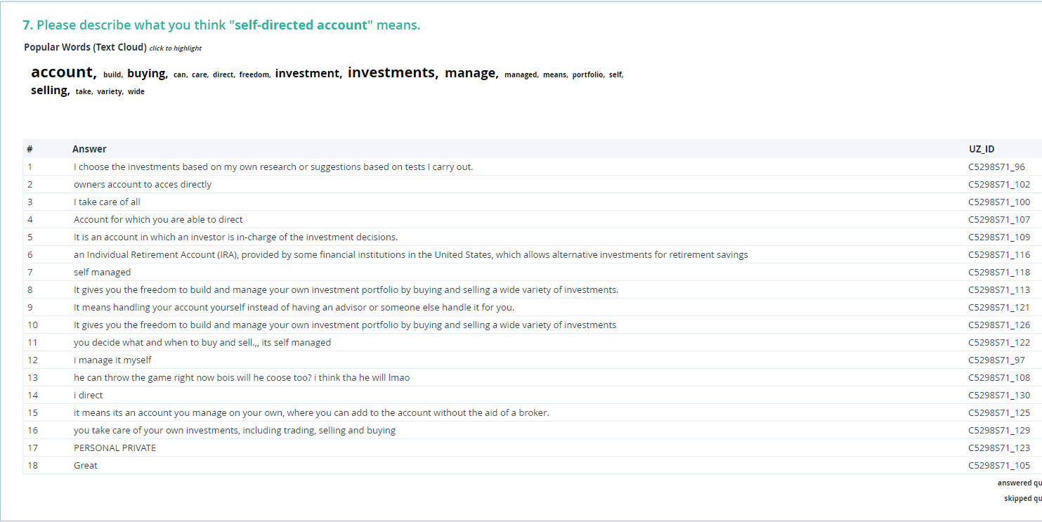
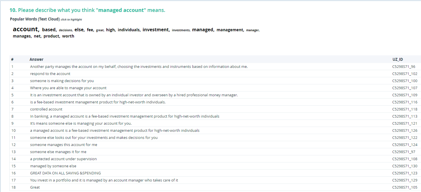
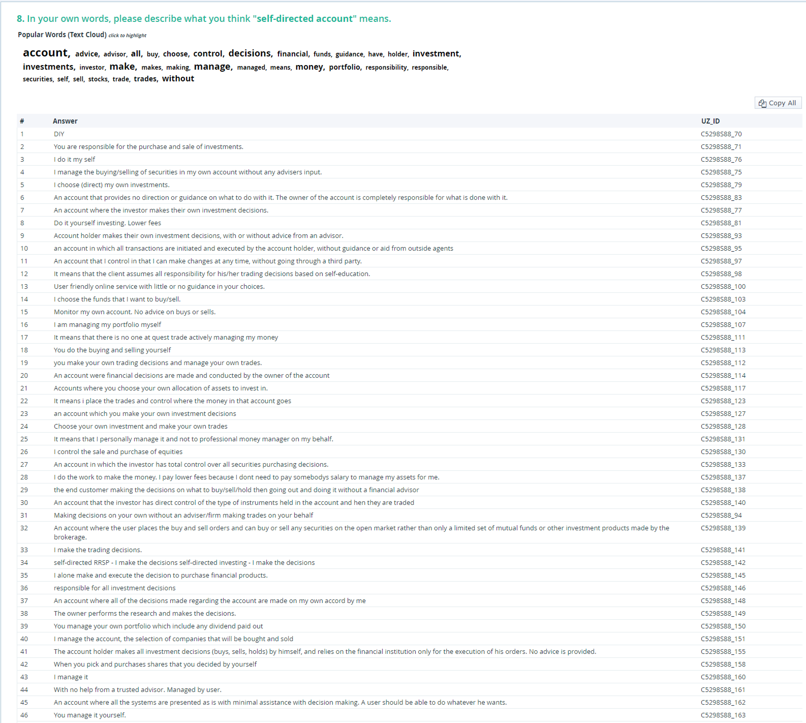
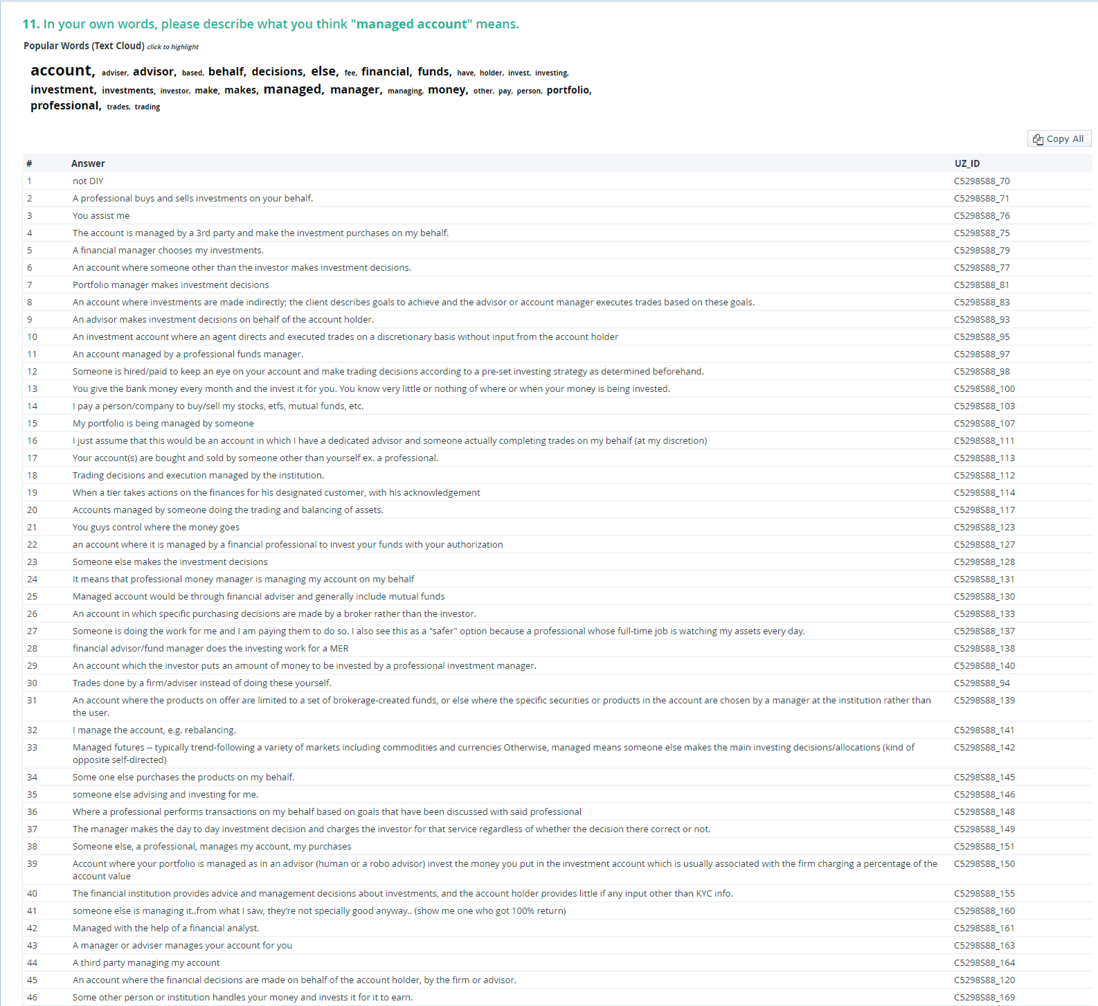
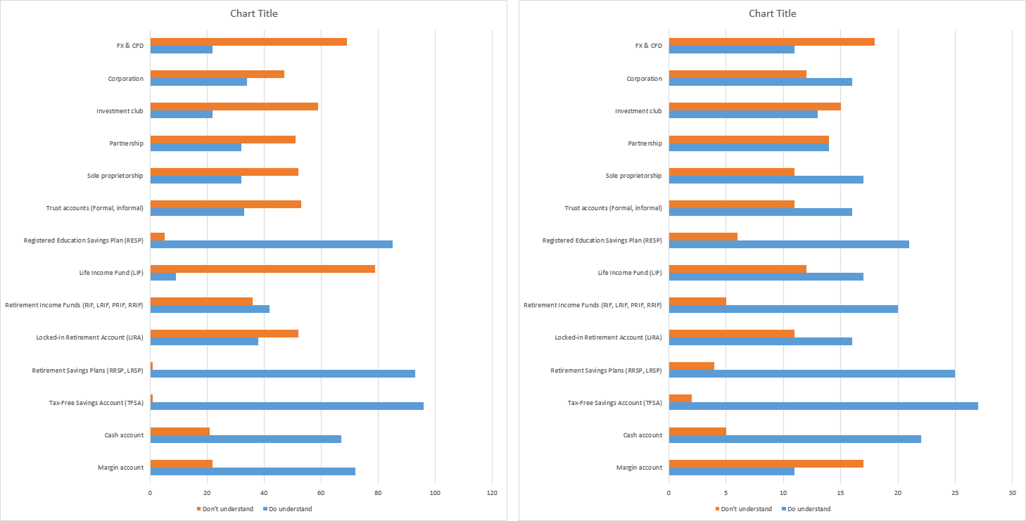
We gathered feedback from 99 Questrade users and 20 non-Questrade users to assess their knowledge of financial terminology and account types.
Summary of Findings:
- When asked about banking and financial services, users understood the terms "self-directed" and "managed"
- Users knew and understood TFSA, RRSP/LRSP, RESP, and Cash account types the best
- Account types, non-personal accounts, FX/CFD, LIF, RIF, LIRA, and trust were the least understood by users
Recommendations:
- Use the labels "self-directed" and "managed” for Questrade product lines
- Use labels to group account types that were not well-known, such as, Retirement, Education, etc.
User Testing
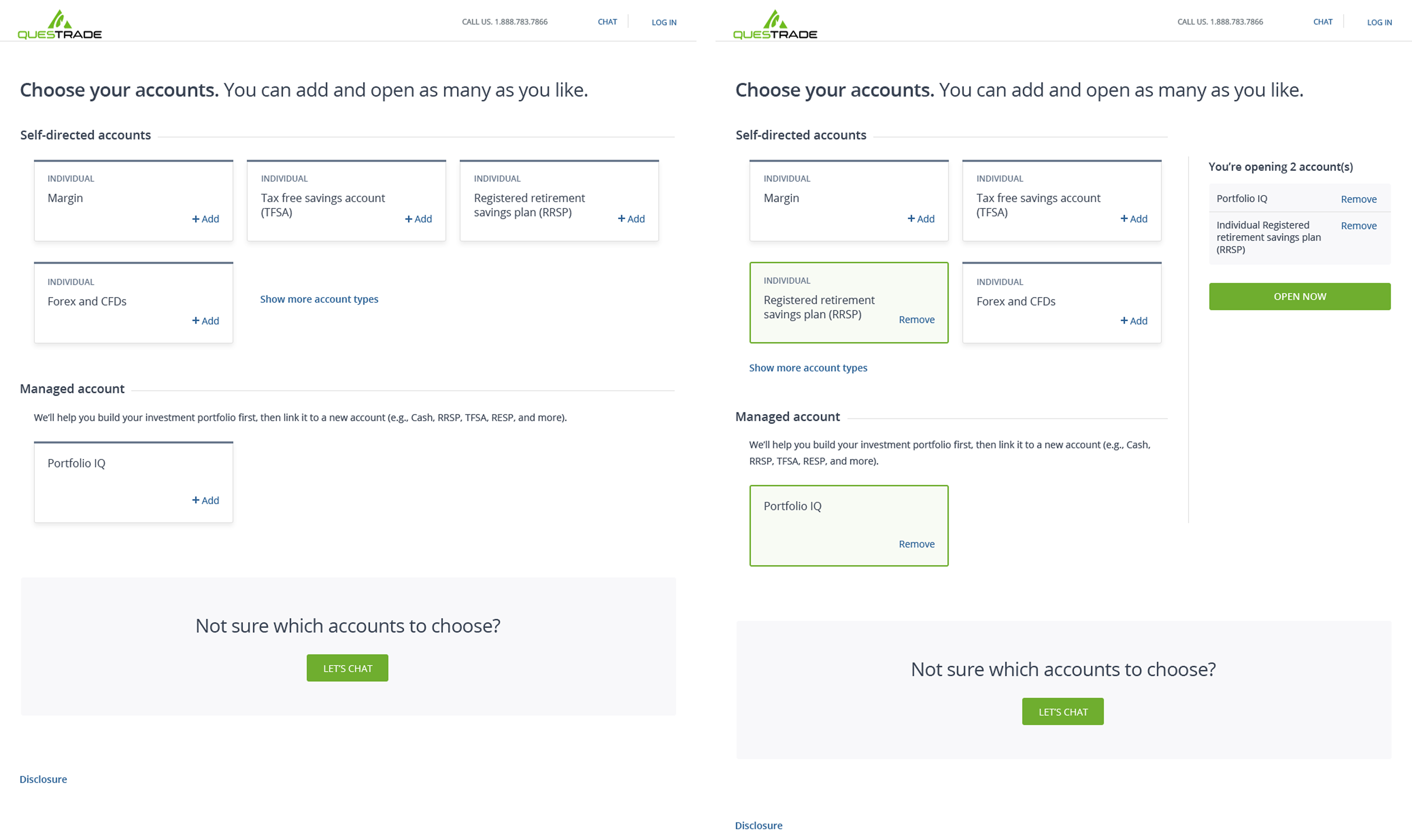
Based on our findings from the user survey and stakeholder interviews, we created two concepts for the account selection screen specifically because that was the critical part of the entire account opening process. We needed to test our approach for the account selection screen before tackling other aspects of the application process.
Summary of Findings:
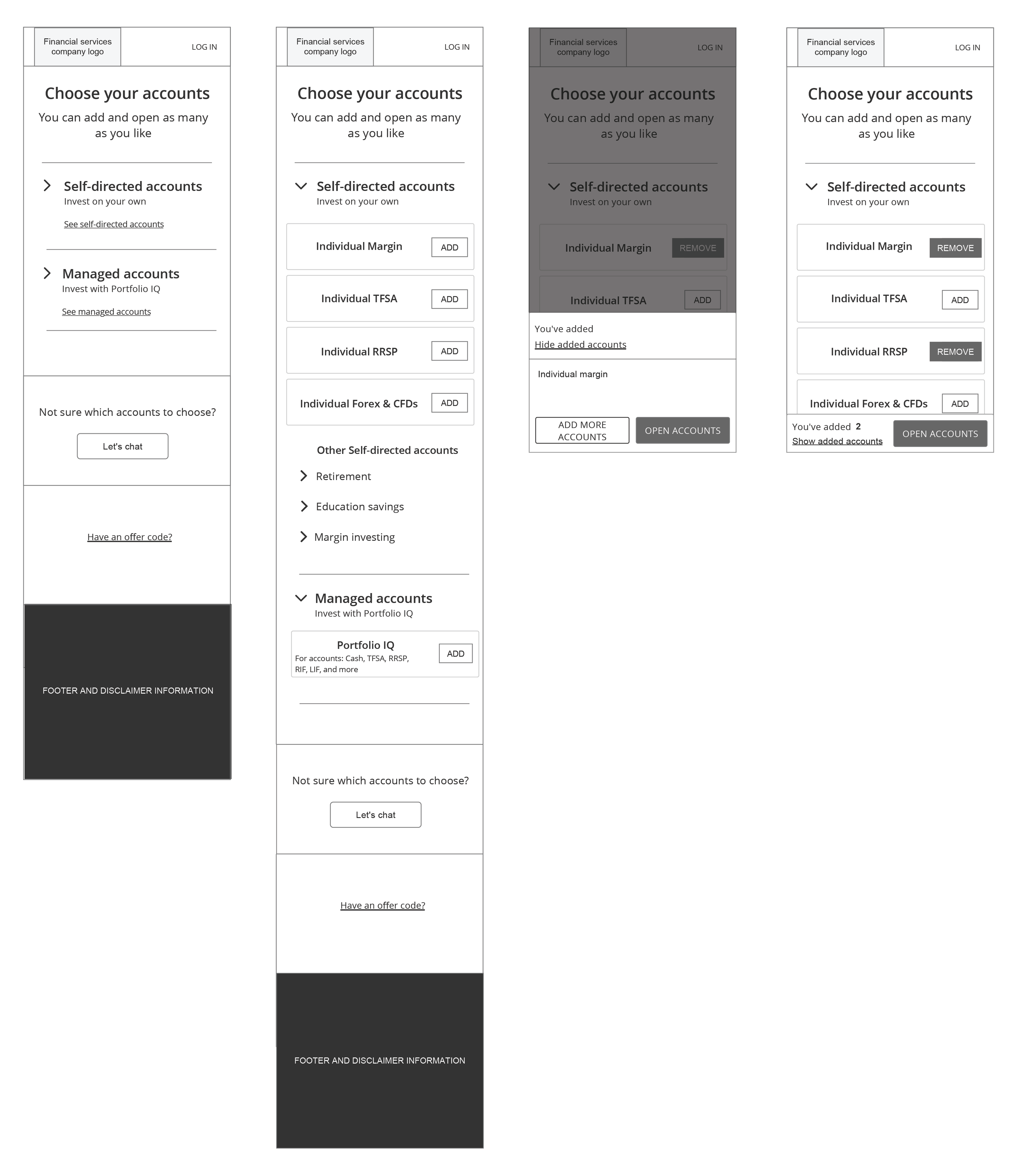
Account selection concept 1:
- Users understood they could open multiple accounts at once
- After selecting their accounts, users didn't know where to go to continue opening their accounts
- The call to action "Open Accounts" was out of user's line of sight
- There was no immediate feedback to the user once they 'selected' an account
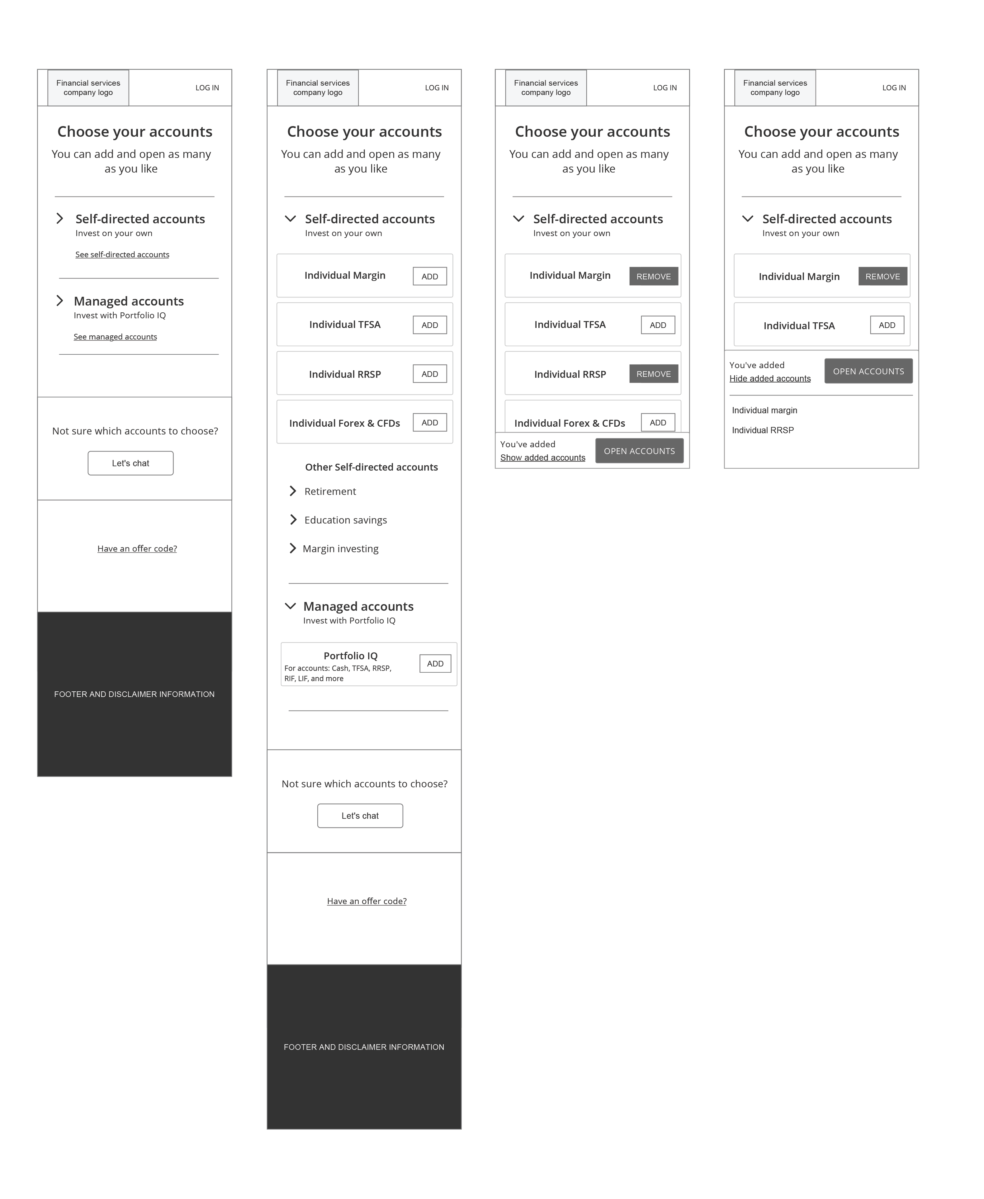
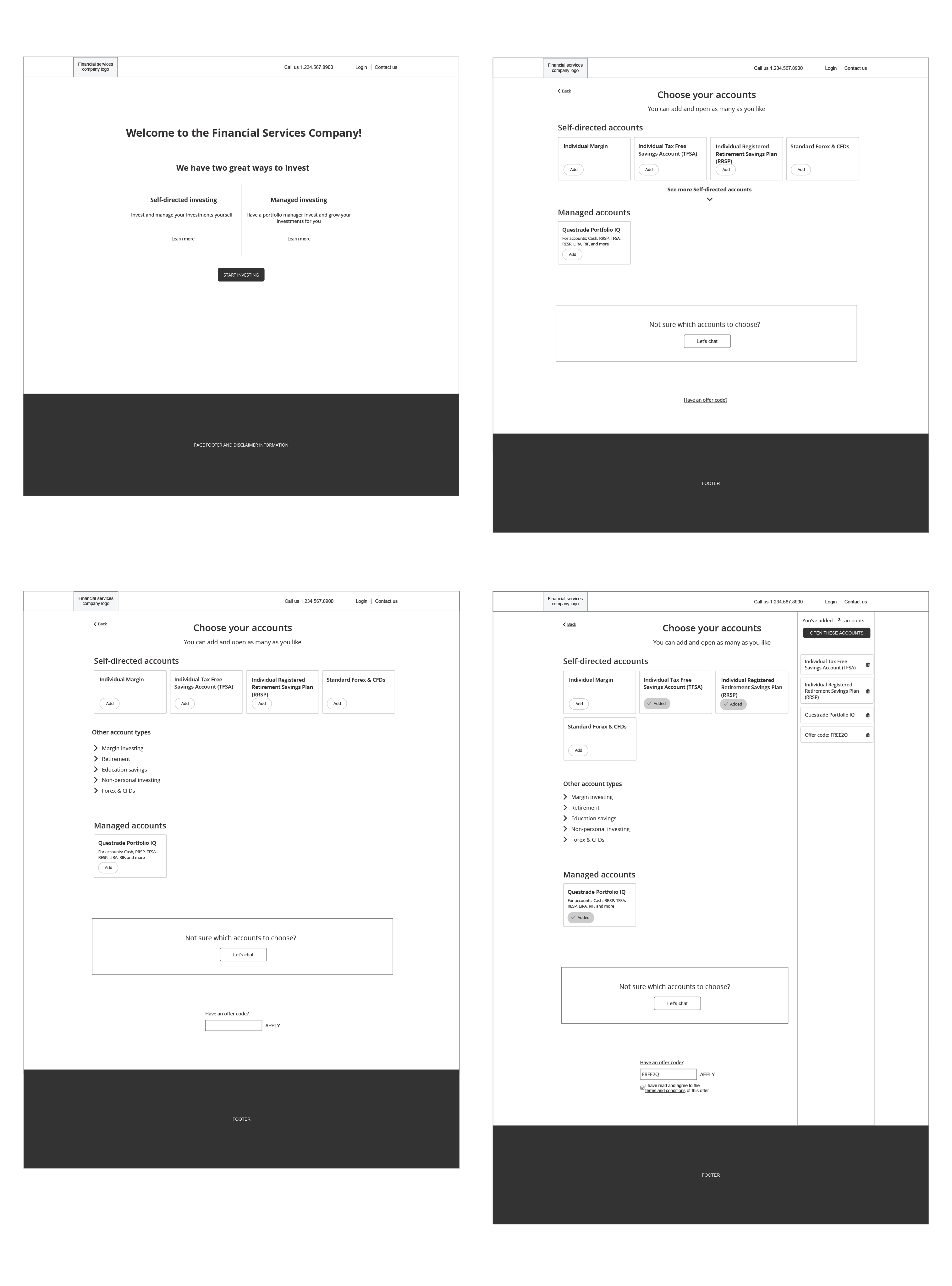
Account Selection Concept 2:
- Users understood they could open multiple accounts at once
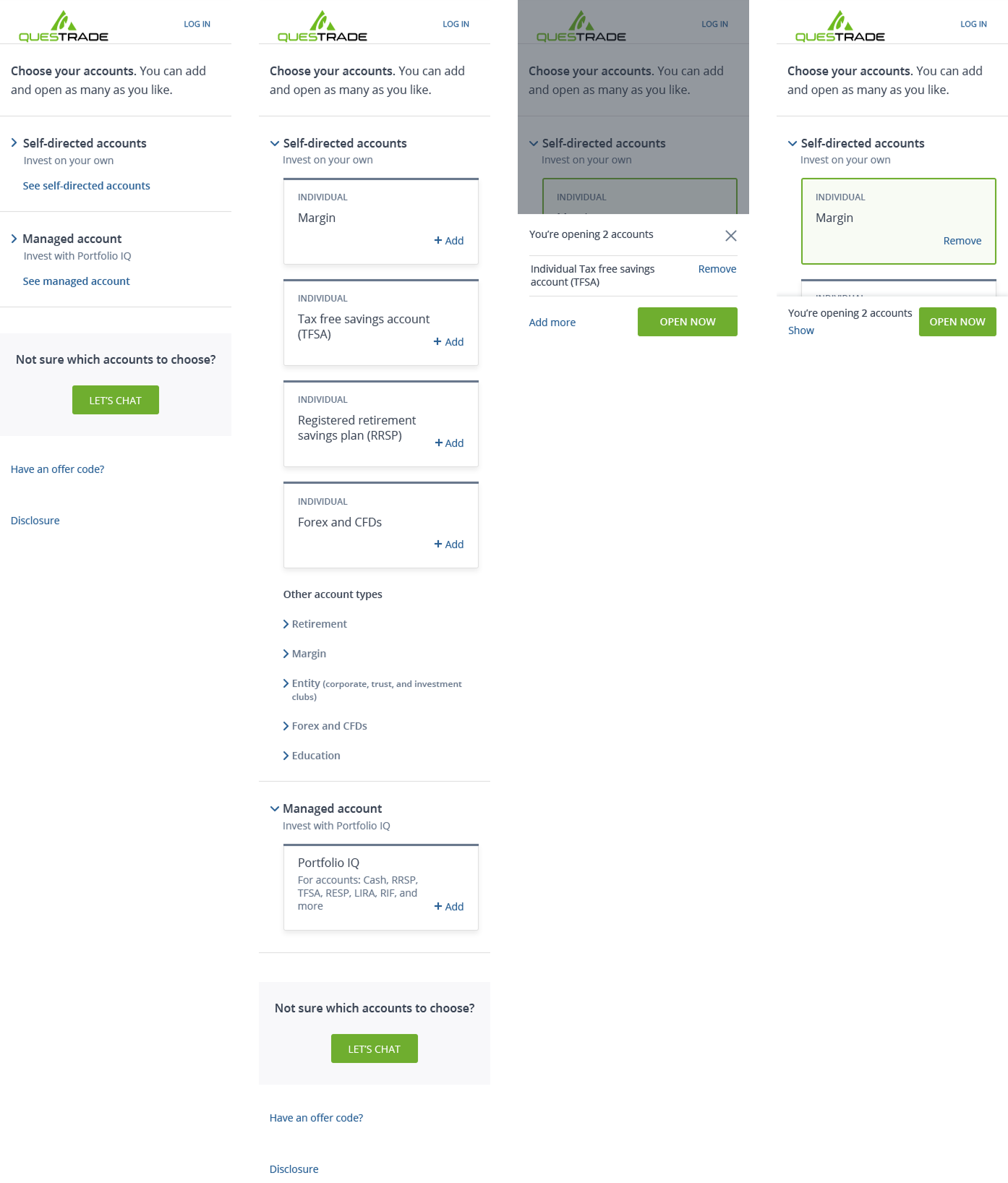
- Once users selected an account, a confirmation panel appeared with a prominent call to action and a list of selected accounts (similar to shopping cart experience)
- Users indicated that the overall they had a pleasant experience and choosing accounts was simple and easy
As a team, we agreed to move forward with concept 2 since it performed well, and users had a positive experience with it.
Account selection concept 1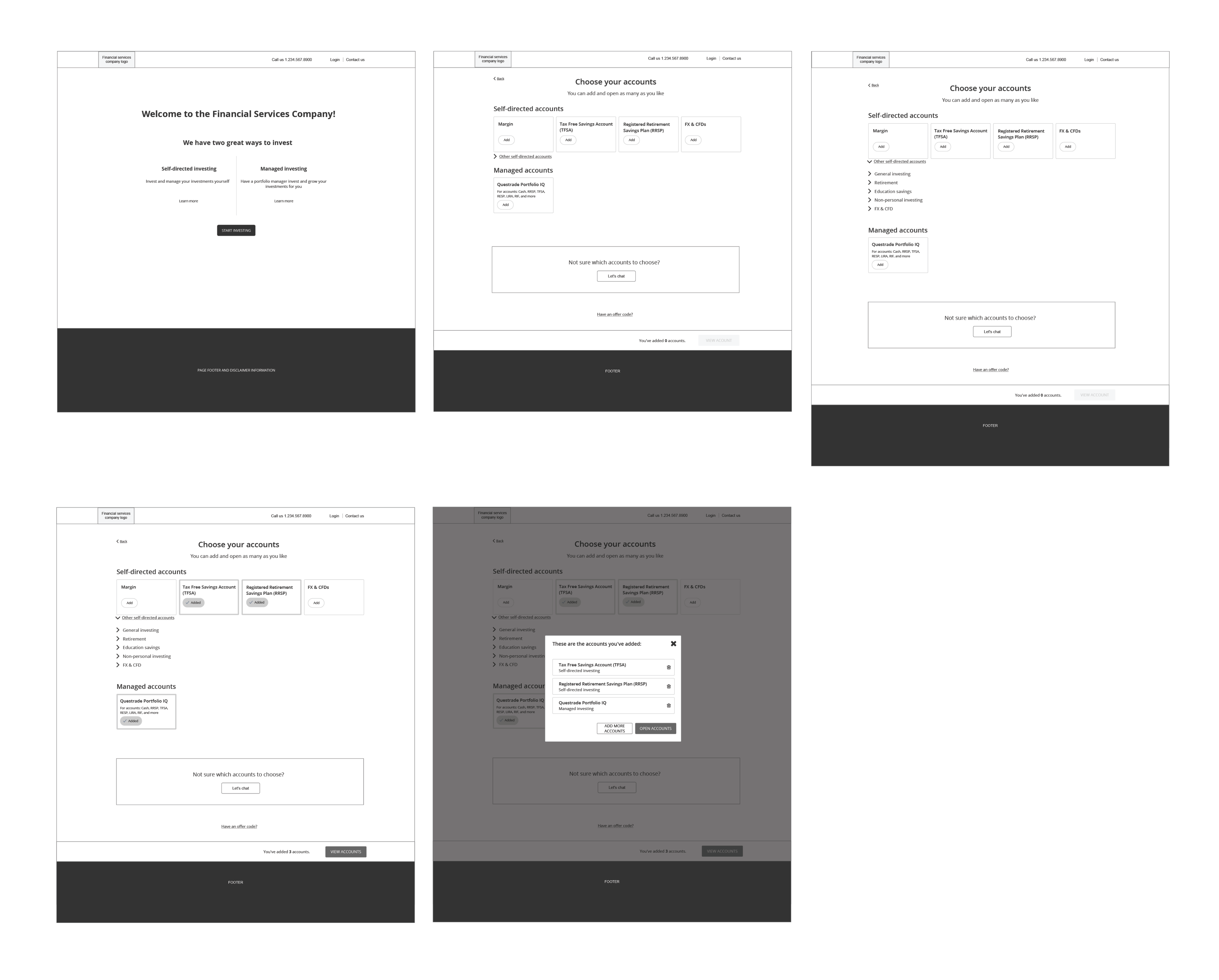
 Account selection concept 2
The Solution
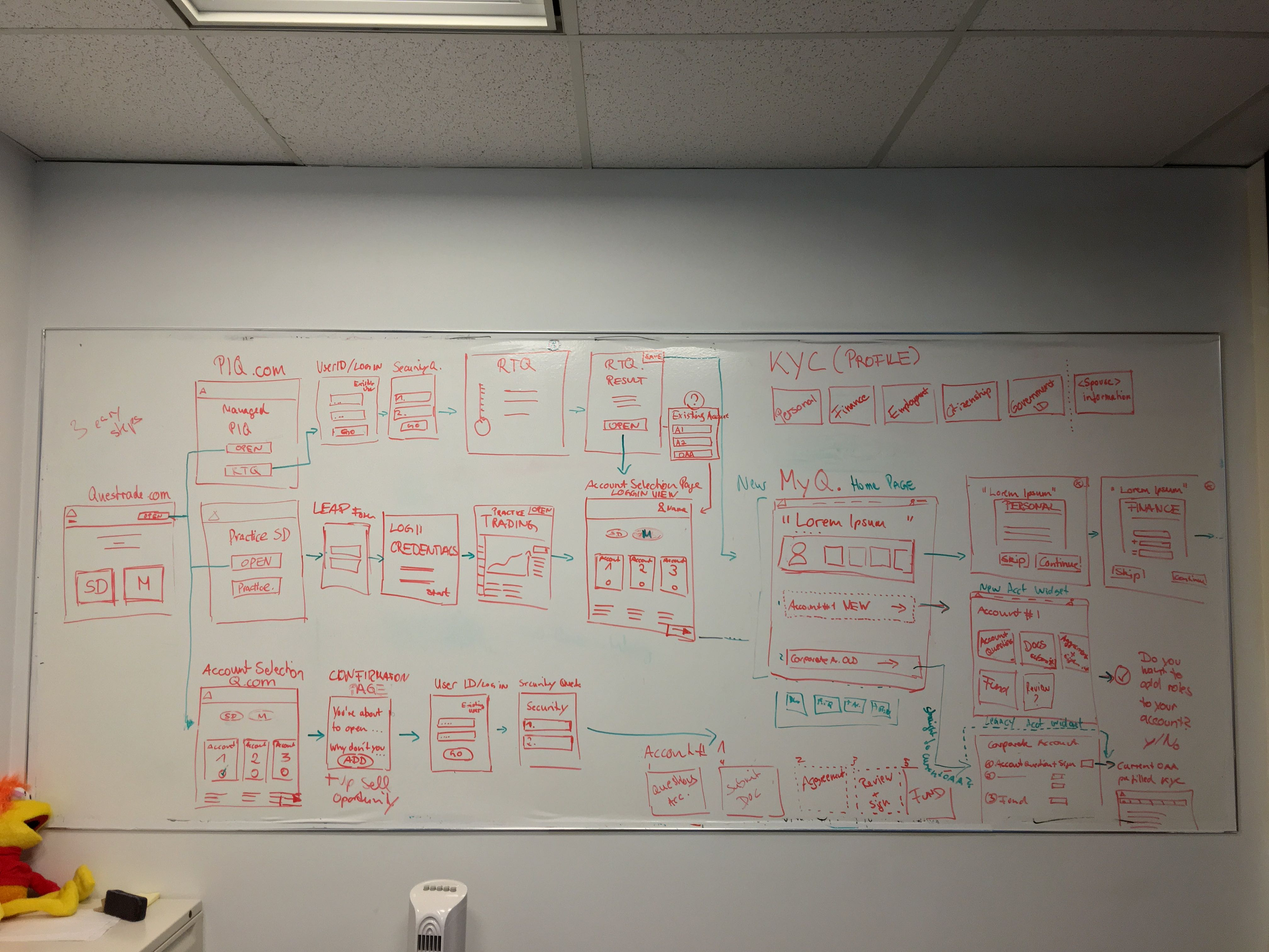
Being in the financial industry we needed to follow rules and regulations set by the regulatory bodies in Canada, as a result, we were unable to remove questions from the application to condense the process.
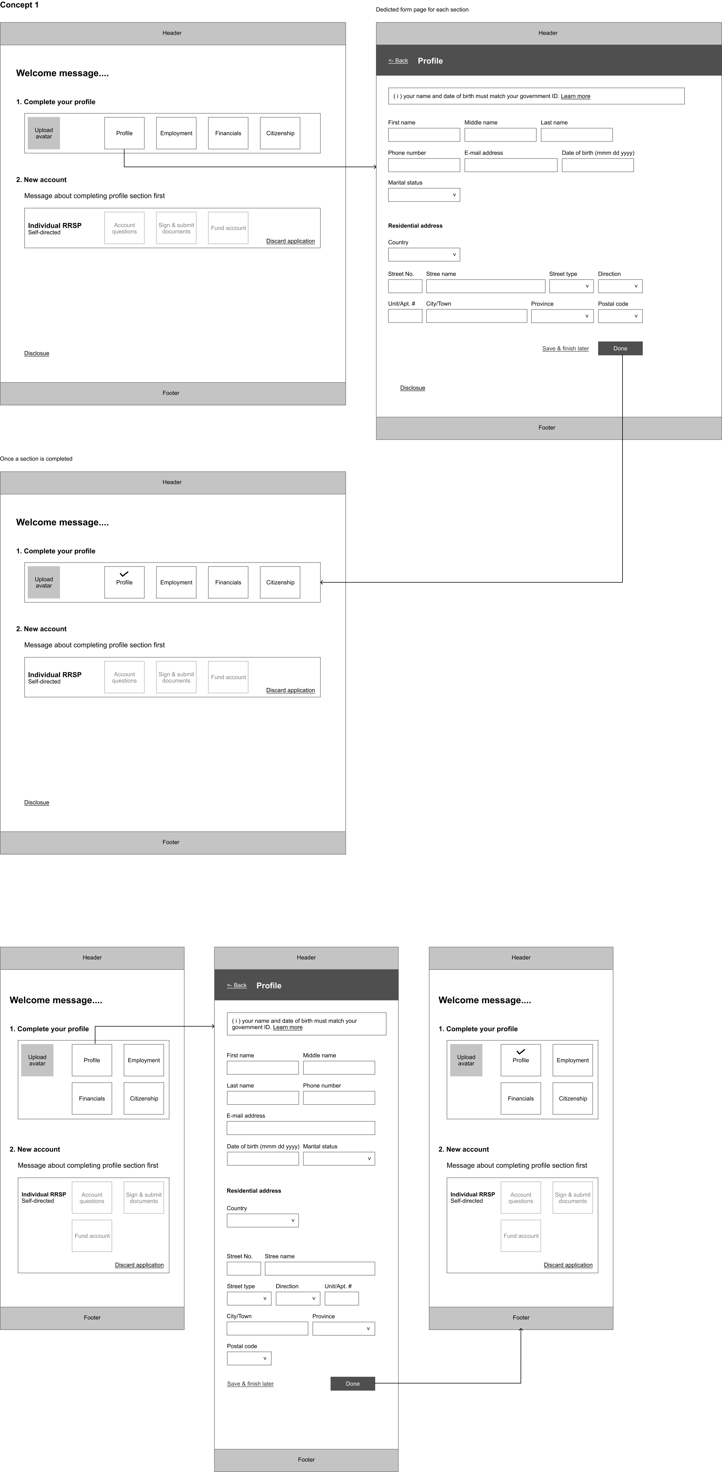
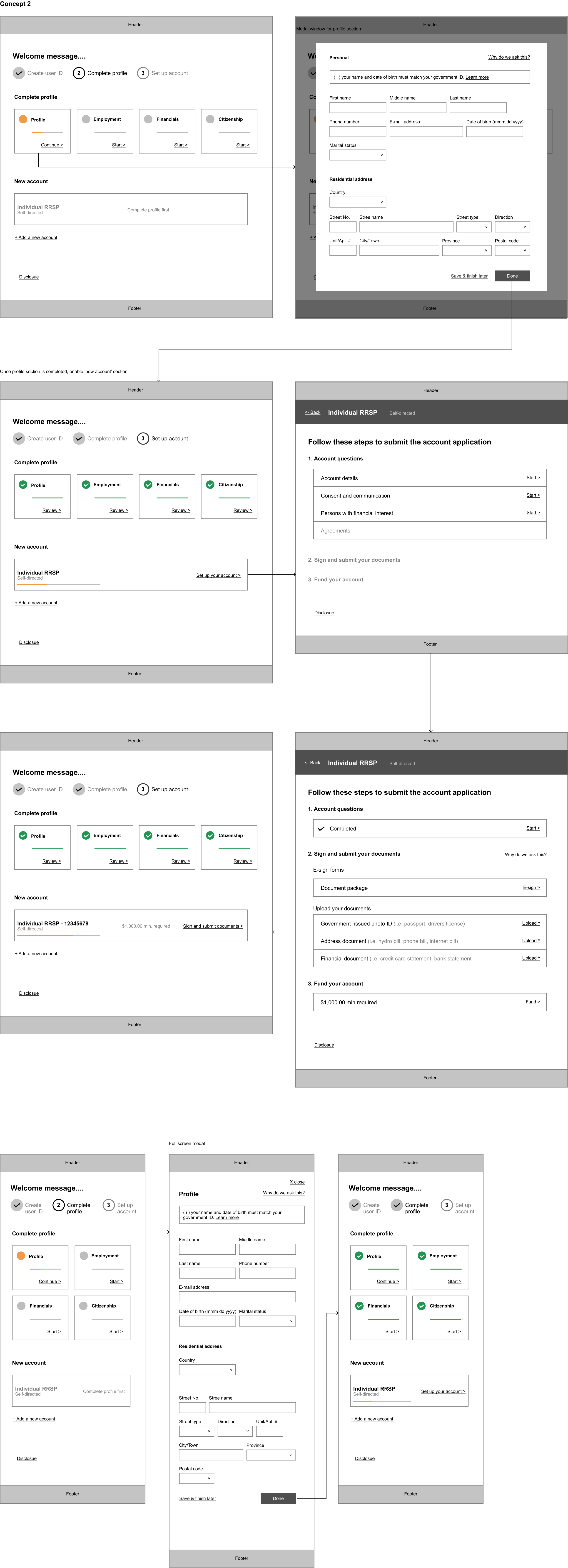
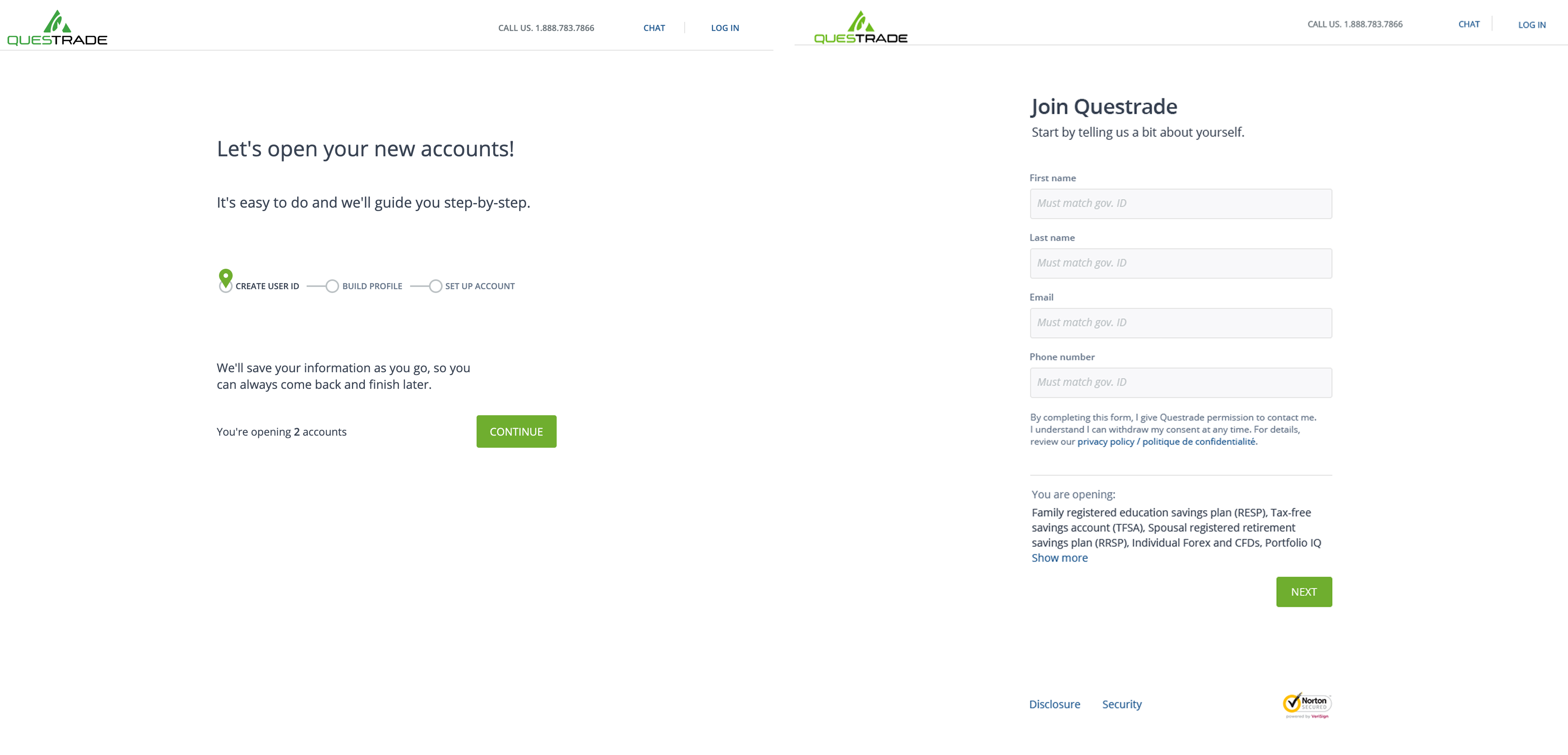
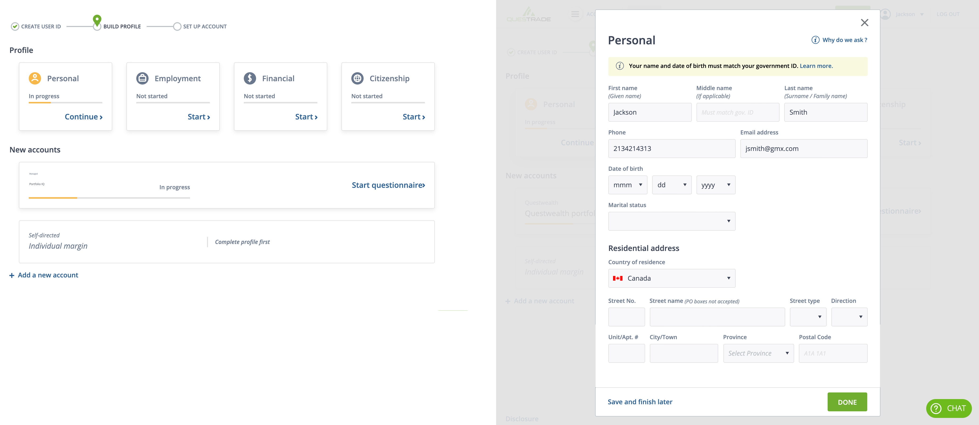
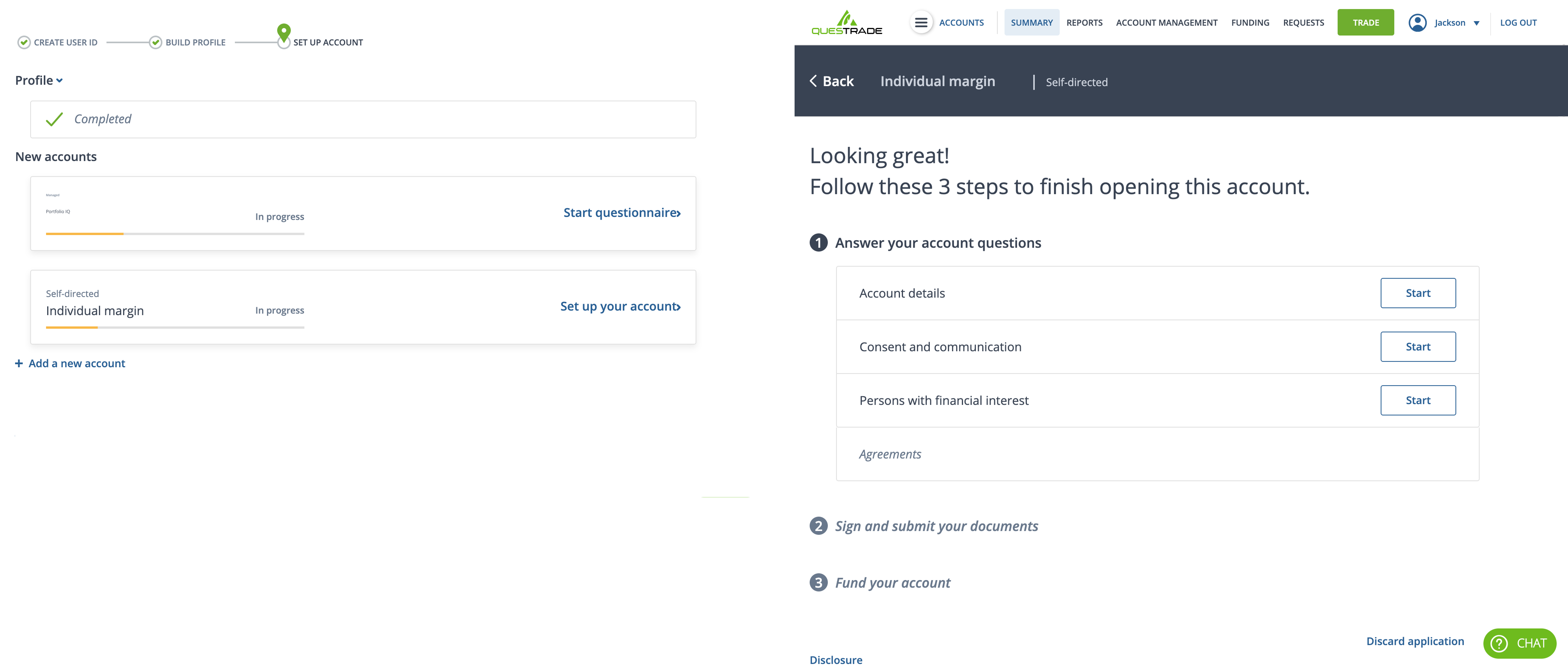
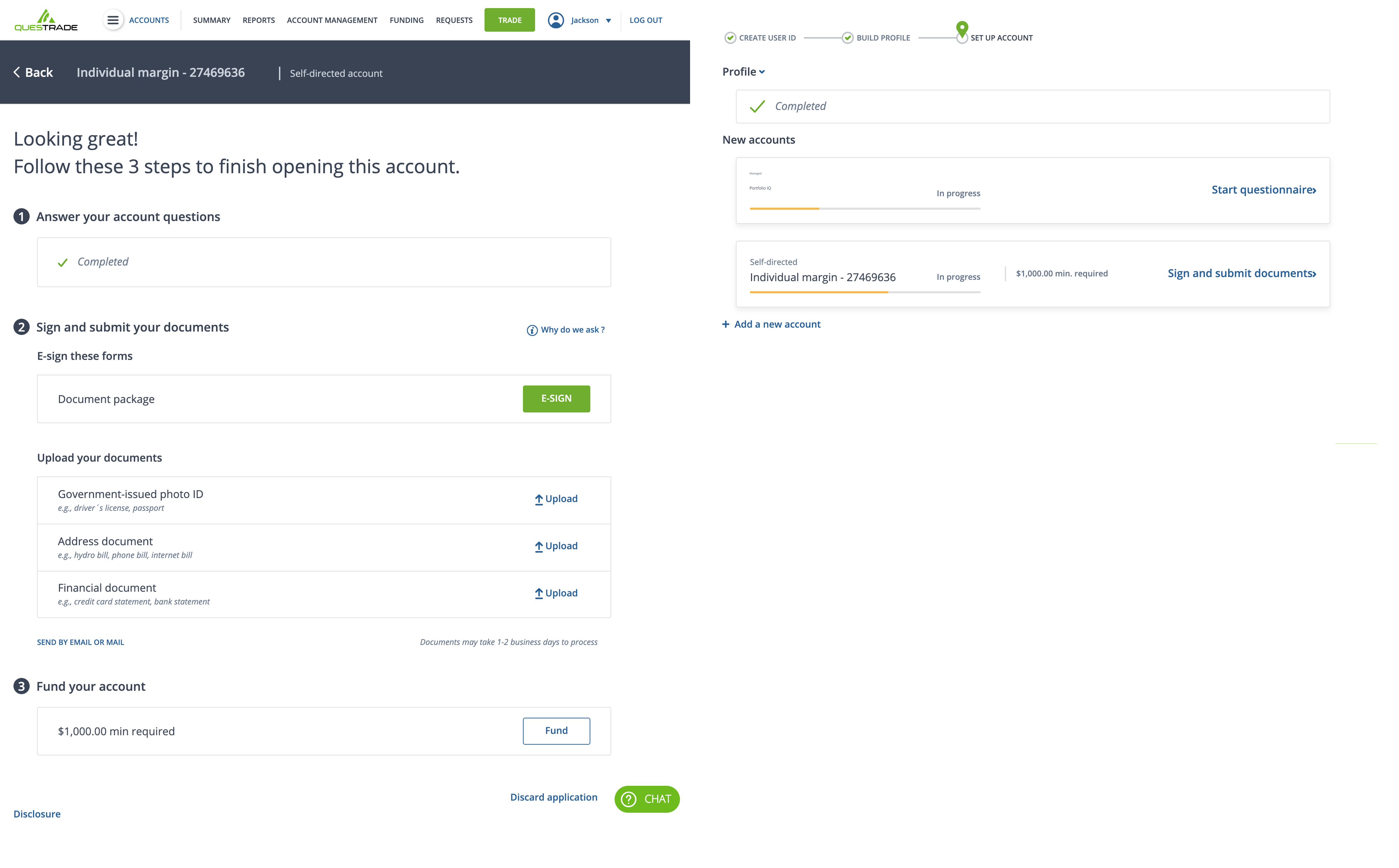
- Created a multi-step process that visually tracked and helped guide the users through the entire process
- Built a clear distinction between completed, in-progress, and not started steps
- Where possible, explained to the user why personal information and documentation were required
- Used progressive disclosure techniques to help prioritize user's attention and task
 Concept exploration 1
 Concept exploration 2
 Visual design
Next Steps
From a UX perspective, my next area of focus would be to facilitate another round of usability testing of the whole account opening process to ensure users can go through the process with minimal issues. Any issues that would arise during the testing sessions would either be addressed or fed into the backlog, depending on the severity of the issue.
During the development phase, I would work closely with the development team to ensure that our designed approach is carried forward, work with the team to solve any issues that may arise and quality-check the work-in-progress. Post-launch, I would monitor google analytics reports, Clicktale reports, user feedback and conduct further usability testing to capture any outstanding usability issues.